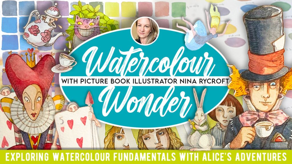
“Watercolour Wonder 2025” with Nina Rycroft
Woohoo! Watercolour Wonder is back!
This time for 6-Weeks. “Watercolour Wonder 2025” with Nina Rycroft
I had a great experience retaking this course with Nina Rycroft, a talented illustrator based in Australia. You can see her published works HERE. This workshop centered around the classic Lewis Caroll story, Alice in Wonderland.
Objects
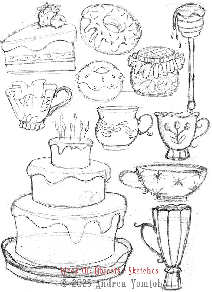
Object Sketching & Planning
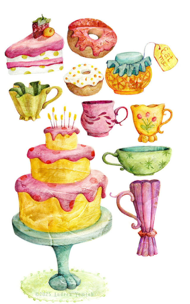
Object Sketch & Planning
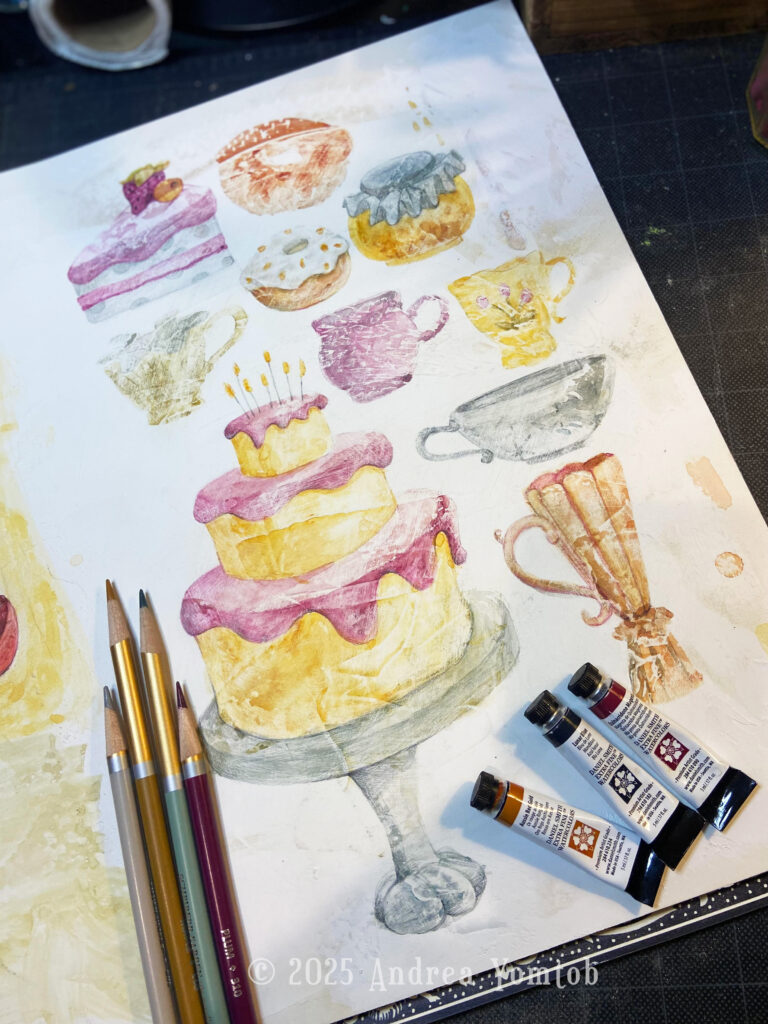
This was fun! Last year, I designed objects based on Lewis Carroll’s excerpt where Alice falls down the rabbit hole. But this year, I chose to select items I pictured on the MadHatter’s teaparty table.
“There was a table set out under a tree in front of the house, and the March Hare and the Hatter were having tea at it: a Dormouse was sitting between them, fast asleep… The table was a large one, but the three were all crowded together at one corner of it. ‘No room! No room!’ they cried out when they saw Alice coming. … The March Hare took the watch and looked at it gloomily: then he dipped it into his cup of tea, and looked at it again: but he could think of nothing better to say than his first remark, ‘It was the best butter, you know.’”
Lewis Carroll: Alice in wonderland, 1865
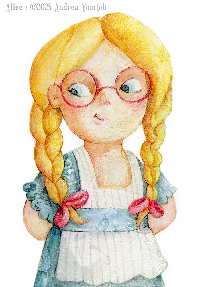
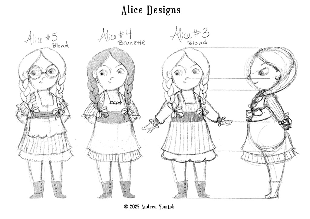
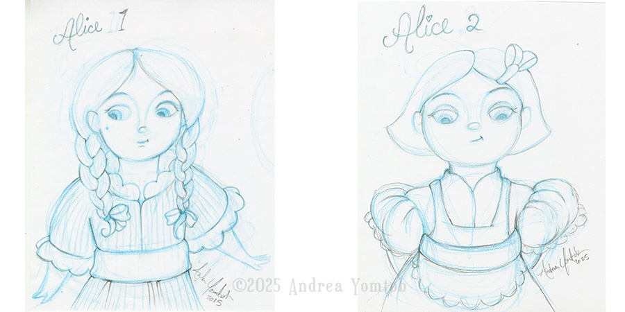
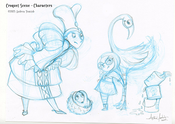
Character Design
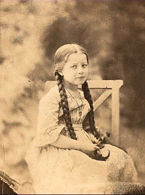
HISTORICAL REFERENCE
I love history, so I enjoyed researching the way children dressed in the late 19th Century. This part of the course brought in traditional drawing skills. Nina provided worksheets showing proportions by age and simple shapes to help create character maps.
DESIGNING DIFFERENT CHARACTERS
I focused mainly on Alice and the Queen Of Hearts again. Nina provided valuable feedback on her Facebook Private Group, as well as in Live sessions, which was very helpful.
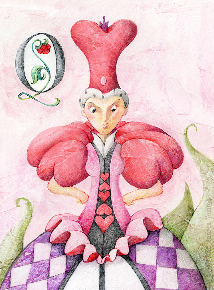
Designing Playing Cards
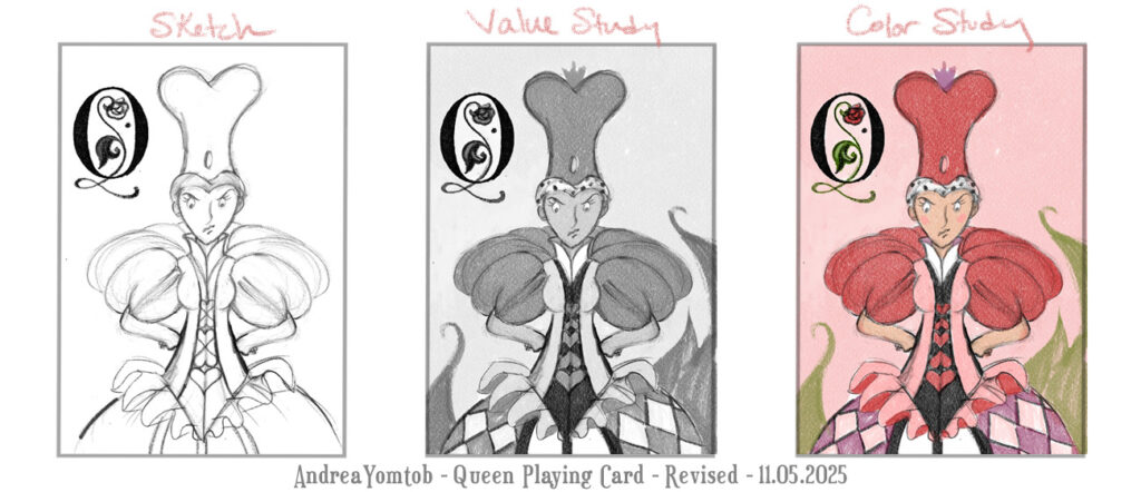
DESIGNING
I designed first by sketching in non-photo blue pencil. Then, I refined with pencil. I focused on the Queen, primarily. I worked through a value study and a color study before painting in watercolor.
PAINTING IN WATERCOLOR
I love painting in watercolor. I texture my board, mapped out my colors. I used PH Martin’s Scarlett, Opera Pink, and Olive Green with a touch of Imperial Purple. I follow up with Prisma pencil for details.
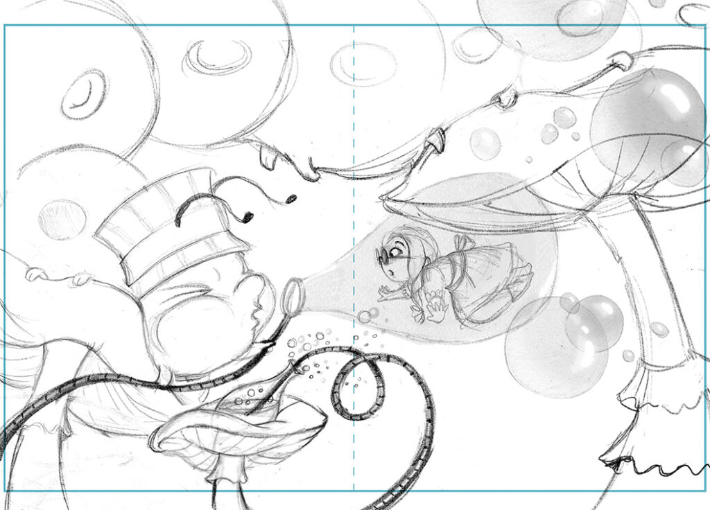
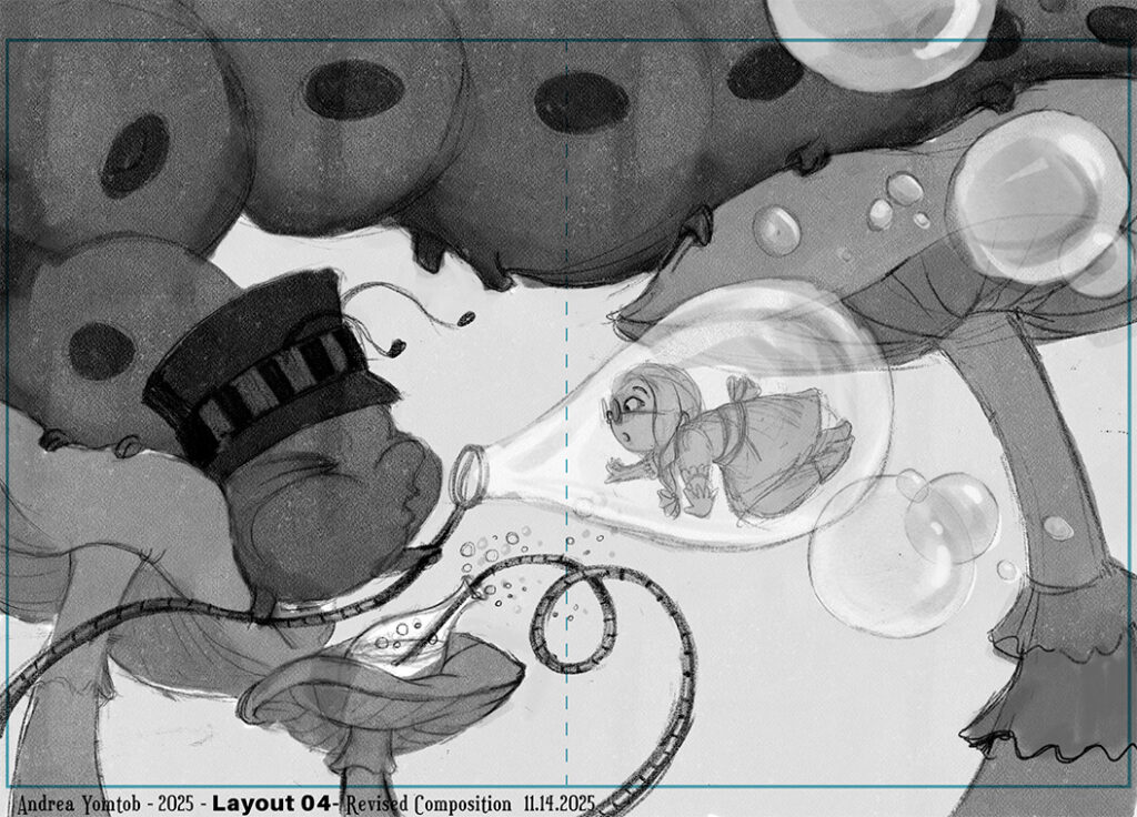
Caterpillar Double Spread Illustration
COMPOSITION
Nina reviewed many different composition and design rules. I sketched out three double-page spreads for ideas on the same scene. I had great feedback from Nina. I went with a double-page spread. Here is a sketch and value study. I’m still working on the final painting and will post it here when it’s done.
HOPE TO SEE YOU AT THE NEXT WORKSHOP!
I enjoyed taking this course again with Nina Rycroft. She’s truly a fantastic teacher, provides wonderful feedback, and has a lot of enthusiasm for her students and the picture book industry.
https://www.ninarycroft.com.au/about-watercolour-wonder